Dark kitchen cabinets make a bold, sophisticated statement, but they can also swallow light and make a space feel cramped if you pair them with the wrong wall color. The right paint color scheme transforms dark cabinets from a design risk into a stunning anchor. Homeowners often struggle with this pairing because it requires balance: go too dark on the walls and you’ve created a cave: go too light and you lose visual cohesion. This guide walks through nine proven combinations that designers rely on, from soft neutrals that brighten the room to moody tones that lean into drama. Whether you’re working with espresso, charcoal, or navy cabinetry, these schemes show exactly what works and why.
Table of Contents
ToggleKey Takeaways
- Paint color schemes for kitchens with dark cabinets must balance brightness and visual weight—soft whites and warm neutrals brighten the space, while cool tones and moody colors create intentional contrast.
- Soft white, cream, and warm beige wall colors reflect light around dark cabinetry and prevent kitchens from feeling cramped, making them the safest and most forgiving palette choices.
- Cool-toned walls (pale blues, soft grays, and seafoam) pair beautifully with dark cabinets in contemporary kitchens with stainless steel appliances and create a sophisticated, design-forward look.
- Moody, darker wall colors alongside dark cabinetry require confidence, adequate natural and artificial lighting, and contrasting light surfaces to avoid making the kitchen feel cave-like.
- Always test paint samples on a large wall section under your kitchen’s actual lighting conditions at different times of day, as darker shades and cool tones look dramatically different in morning versus evening light.
- Semi-gloss or satin finishes perform better than flat paint in kitchens, particularly with darker wall colors, because they’re easier to clean and resist visible dust and cooking splatter.
Why Wall Color Matters When You Have Dark Cabinets
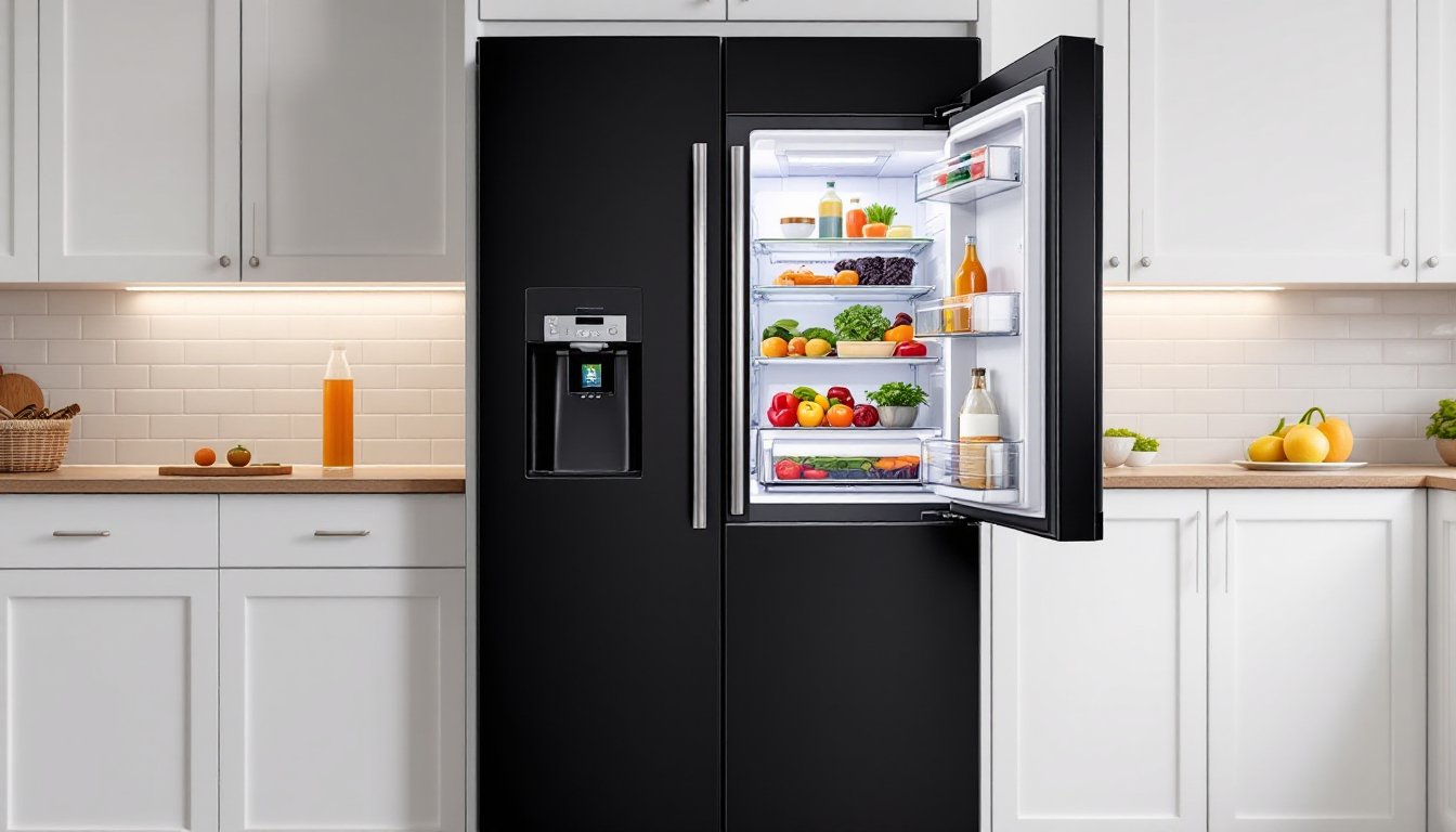
Dark cabinets consume light. They anchor a room visually and demand respect in the color palette, get the walls wrong and the entire kitchen feels off-balance. Wall color isn’t decorative afterthought: it controls how much visual weight your dark cabinets carry and whether the space feels open or enclosed.
When cabinets are dark (espresso, charcoal, navy, or deep gray), they create a strong downward visual pull. A poorly chosen wall color either competes with that weight or amplifies it. Pale walls reflect light and create breathing room around dark cabinetry, while cool-toned walls add sophistication without adding visual mass. Warm neutrals bridge the gap, grounding the cabinets without making the kitchen feel cramped.
The interaction between cabinet color and wall color also affects how much light your kitchen reflects back. Dark cabinets absorb light, so your wall color compensates by either bouncing light (via light, reflective finishes) or creating subtle contrast that defines the space. Professional designers start with this principle: dark cabinets need walls that either enhance brightness or create intentional, confident contrast.
Neutral & Warm Palettes: Creating Balance And Brightness
Neutral and warm palettes are the safest, most forgiving pairings with dark cabinets because they don’t fight for attention. These schemes rely on the cabinets as the dark anchor and use wall color to define light and depth. Most kitchens with dark cabinets use some version of this strategy, and for good reason: it works in almost every lighting condition and allows flexibility with accent colors and hardware.
Soft Whites And Creams For Maximum Light
Soft white and cream walls are the classic pairing with dark cabinets. Not builder-grade bright white (which reads as sterile), but soft whites with subtle undertones, Benjamin Moore’s Cloud White, Sherwin-Williams’ Alabaster, or Farrow & Ball’s Pointing are reliable choices. These reflect maximum light while staying warm enough to feel inviting alongside dark wood or painted cabinetry.
Soft white works because it doesn’t compete visually: the cabinets stay the focal point. Light bounces off white walls and around dark cabinet doors, making even a modest kitchen feel larger. Pair soft white walls with brushed nickel or matte black hardware and the contrast becomes elegant rather than harsh. A cream undertone (warmer than pure white) works especially well if your cabinets have warm undertones, espresso with reddish notes, for example, pairs beautifully with cream walls.
One practical note: semi-gloss or satin finishes on kitchen walls hold up better than flat finishes because they’re easier to wipe down when cooking splatter lands. Flat paint looks richer but requires touch-ups. Test a quart in your actual kitchen light before committing to a gallon.
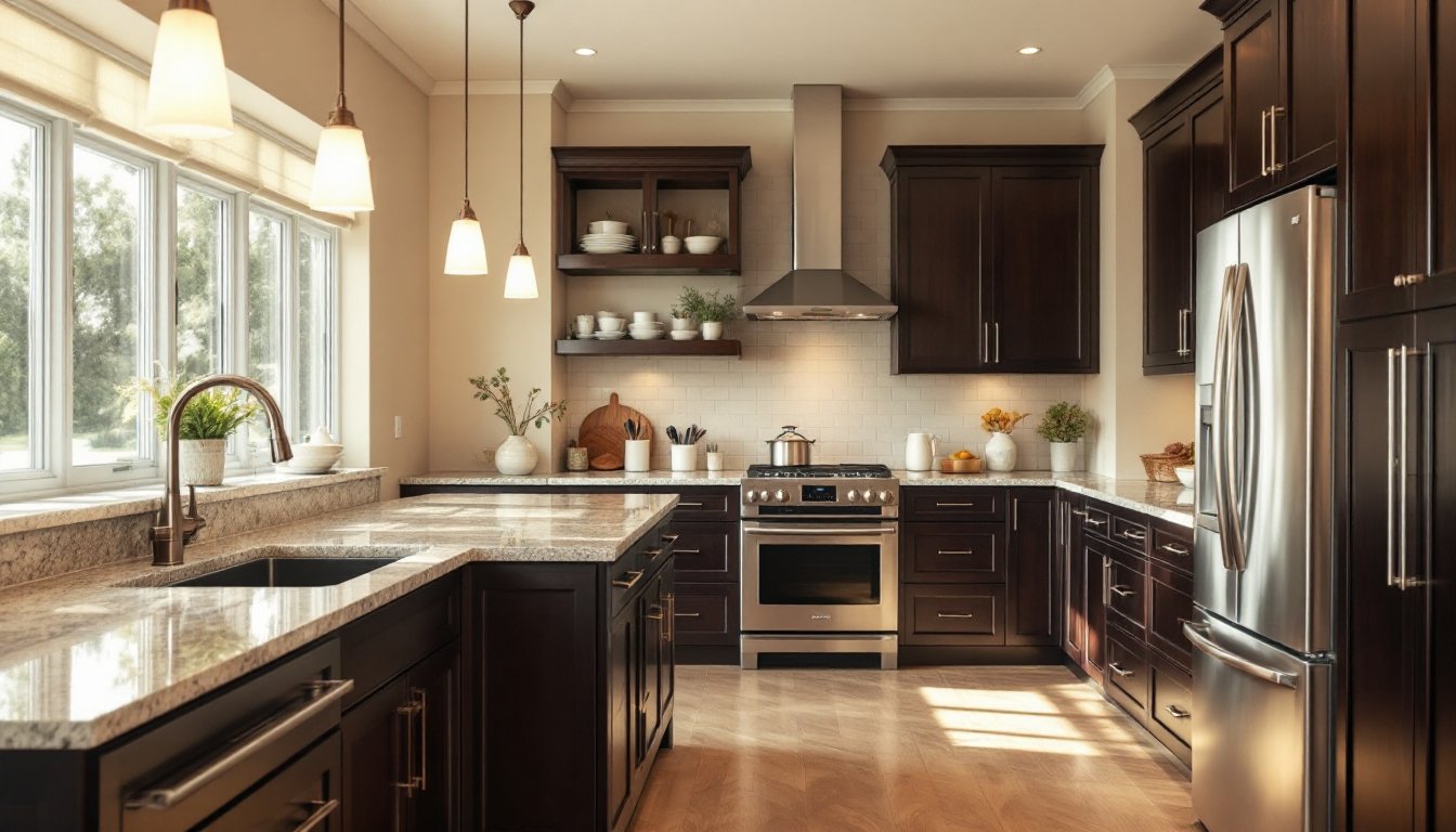
Warm Beiges And Taupes For Depth
Warm beige and taupe walls add subtle depth and richness that pure white can’t match. These warm neutrals work especially well when your dark cabinets are paired with warm-toned countertops (butcher block, honey-colored granite, or warm stone). Sherwin-Williams’ Accessible Beige, Benjamin Moore’s Hale Navy’s warm neighbor, or Farrow & Ball’s String create a sophisticated, layered look.
Warm beige grounds the space by echoing natural wood tones in flooring and counters, while still remaining light enough to brighten around dark cabinetry. Taupe adds a gray undertone that feels modern without the cold sterility of pure gray. The depth prevents the space from feeling flat while the lightness prevents it from closing in.
This palette works beautifully in kitchens with island seating or open floor plans because the warm tones visually blend kitchen and living areas. If you’re considering a rustic aesthetic, Rustic Kitchen Design: Create a cohesive narrative with warm beige walls and dark natural wood or painted cabinets. The pairing feels intentional, not accidental.
Cool Tones & Sophisticated Contrast Schemes
Cool-toned wall colors, soft grays, pale blues, and greens, create sophisticated contrast with dark cabinets. Rather than trying to brighten around the cabinets, these schemes lean into the drama and use cool tones to make dark cabinetry look intentional and design-forward. This approach works when you’re confident in your cabinet choice and want the kitchen to feel curated, not accidental.
Cool tones also work beautifully in kitchens with stainless steel appliances, brushed nickel hardware, and contemporary styling. The coolness mirrors the metallic accents and prevents the space from feeling chaotic. If you’re drawn to Coastal Kitchen Design: Transform Your Space into a Serene Beach Retreat, pale blue or soft seafoam walls with dark cabinetry create a sophisticated, relaxed vibe that reads as intentional.
Pale Blues And Soft Grays For Modern Appeal
Pale blue walls (think Farrow & Ball’s Parting Blue, Benjamin Moore’s Palladian Blue, or Sherwin-Williams’ Sea Salt) create a fresh, modern aesthetic alongside dark cabinets. The contrast between cool walls and warm or neutral cabinetry feels contemporary and balanced. Pale blue works especially well in kitchens with abundant natural light because the blue reflects cool light without adding coldness.
Soft gray serves a similar function but feels more neutral and urban. Sherwin-Williams’ Urbane Bronze’s lighter sibling, or Benjamin Moore’s Collingwood creates a modern, gallery-like feel. Gray is more forgiving than blue across different lighting conditions and pairs confidently with nearly any dark cabinet color. The contrast is clear but not jarring.
When choosing cool tones with dark cabinets, consider your lighting carefully. In north-facing kitchens or spaces with limited natural light, pale blue can feel cold and unwelcoming. In sunny, south-facing kitchens, pale blue feels fresh and energetic. Test paint samples in your specific kitchen and evaluate them at different times of day before committing to a full gallon.
Bold & Moody Colors: Going Darker With Confidence
Moody, darker wall colors paired with dark cabinets require confidence, but they create stunning, sophisticated kitchens when executed correctly. This approach abandons the “brighten around dark cabinets” rule and instead leans into intentional drama. The key is choosing the right undertone and ensuring you have adequate lighting, both natural and artificial, to keep the space from feeling cave-like.
Moody colors work best in kitchens with strong architectural features, high ceilings, or abundant natural light. An island with pendant lighting, open shelving with lights underneath, or a large window transforms a moody kitchen from dark and cramped into intimate and sophisticated. Pair darker walls with light countertops, light flooring, or a light island to create visual breaks that prevent the space from feeling overwhelming.
Many of the design strategies you’ll find on Houzz showcase moody kitchens with dark cabinets and darker walls, paired with strong lighting and contrasting surfaces. The lighting is always deliberate, not an afterthought. If you’re considering this approach, plan your lighting upgrades before choosing wall color.
Deeper charcoal, forest green, and rich gray-blue walls create the most sophisticated moody kitchens. Farrow & Ball’s Down Pipe (deep charcoal), Estate Emulsion in Mizzle (soft gray-blue), or Benjamin Moore’s Knoxville Grey pair beautifully with dark cabinetry. These aren’t black walls: they’re sophisticated neutrals with depth.
One practical consideration: matte or flat finishes show dust and splatter more visibly in moody colors than light colors. Choose satin or semi-gloss finishes in darker shades to minimize maintenance headaches. A semi-gloss finish in a deep charcoal actually reads as elegant, not industrial, and cleans up far more easily than flat paint.
Green is another moody option worth considering. Deeper sage, olive, or forest green walls with dark cabinetry create a naturalistic, grounded aesthetic. This palette works especially well if your countertops, hardware, or backsplash include bronze, copper, or brass accents. Green-based moody schemes feel less stark than pure charcoal or blue and pair well with warm lighting from pendant fixtures. Resources like Remodelista frequently feature moody kitchen inspirations with green walls and dark cabinetry as a sophisticated alternative to the typical neutral palette.
If you’re drawn to darker wall colors, start with a test can of sample-size paint and apply it to a large section of wall (at least 3-4 feet square). Live with it for a few days under your kitchen’s actual lighting at different times of day. Moody colors look dramatically different under morning light versus evening light. What reads as intimate and sophisticated in daylight might feel oppressive at night, and vice versa. Proper evaluation prevents expensive repaints.